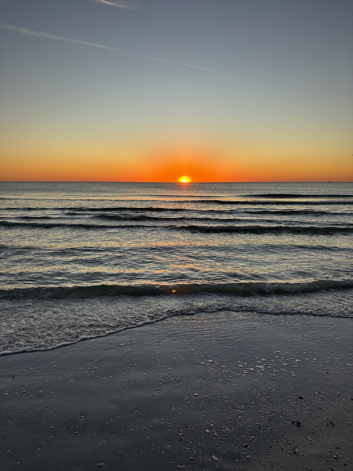
The Quiet Contrast of a Siesta Key Sunset
As an artist, moments like this become a reminder of how powerful contrast can be. Light becomes more radiant when it meets shadow. Color becomes richer when placed beside something quieter. Even stillness feels deeper when paired with movement.
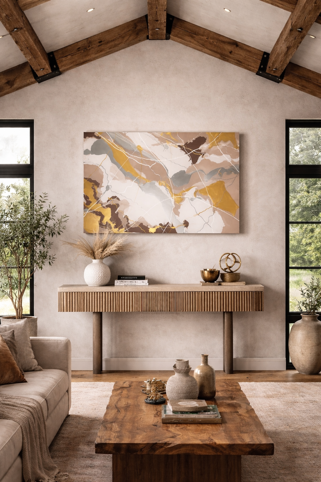
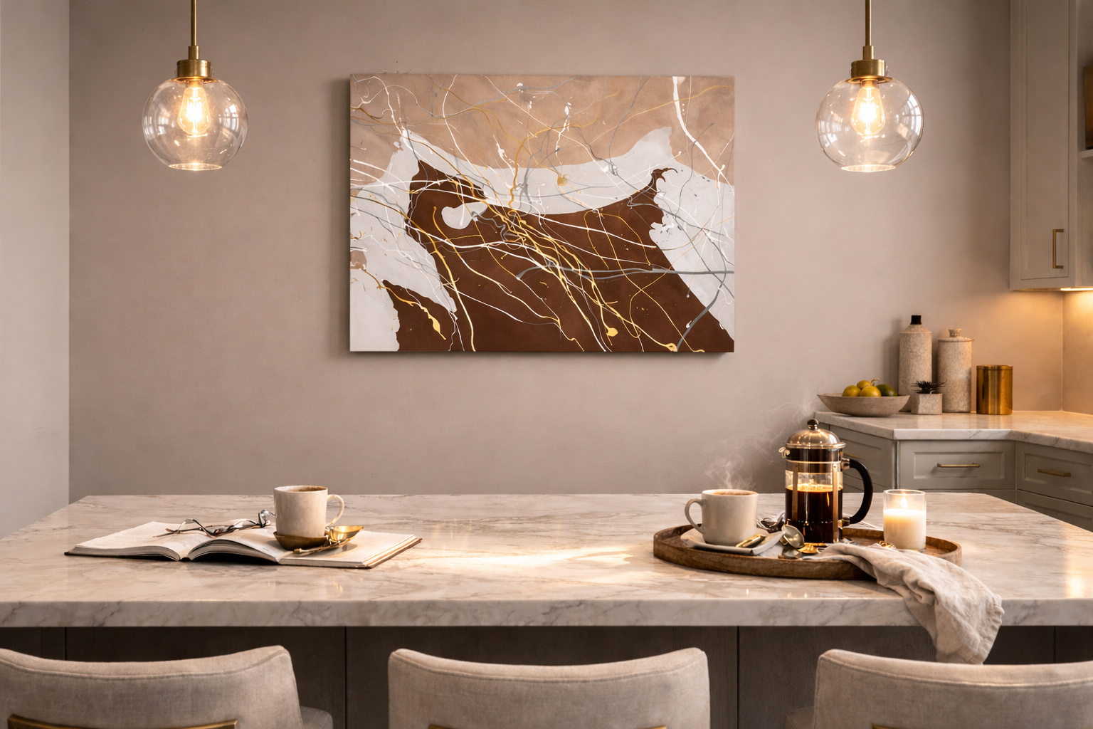
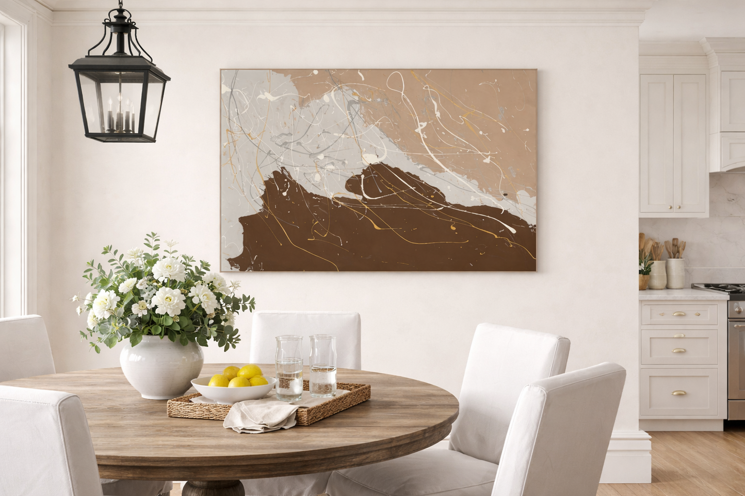
The Strength of Gold and Silver
Gold and silver have always carried a quiet emotional power. Gold brings warmth and confidence, a sense of optimism that feels both timeless and uplifting. Silver, by contrast, reflects light with a softer energy — calm, reflective, and balanced.
Letting Go
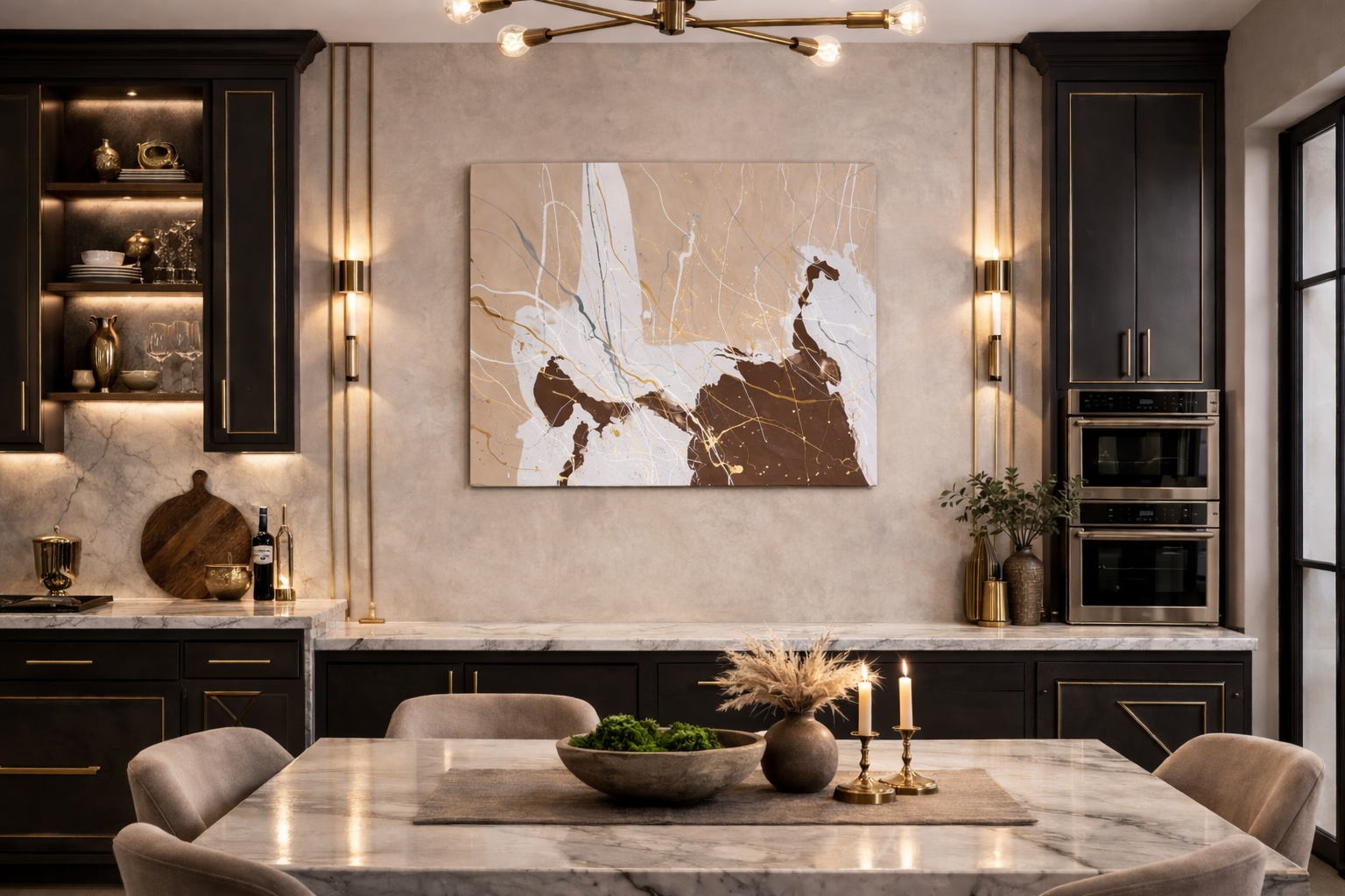
The palette and movement carried a feeling of quiet luxury and warmth — like slow coastal mornings with coffee in hand or the cozy comfort of hot cocoa during the holidays
Seeing in Color
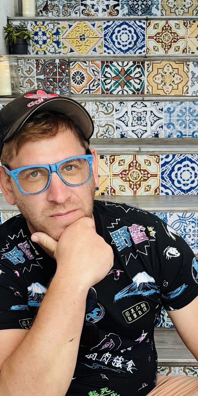
I’ve always been drawn to color — the way it mixes, overlaps, and shifts depending on the light. Sitting on these colorful Talavera-tiled stairs on Anna Maria Island reminded me how much the world itself feels like a palette. Blues, yellows, reds, and greens blending together in unexpected ways. As someone who enjoys painting, I often find inspiration in moments like this. The colors around us, the way they interact, and the quiet beauty in everyday scenes often find their way back into my work. Sometimes all it takes is slowing down and noticing how the world is already mixing colors for us.